Enhancing User Experience by redesigning Microsoft Teams Marketing Website, using Fluent 2 design system

Enhancing User Experience by redesigning Microsoft Teams Marketing Website, using Fluent 2 design system

Enhancing User Experience by redesigning Microsoft Teams Marketing Website, using Fluent 2 design system

Class Project

Class Project

Class Project

Role

Role

UX Research

UX Research

Heuristic Evaluation

Heuristic Evaluation

Redesign

Redesign

Short on time? Here's the TL;DR version to avoid the FOMO!

Short on time? Here's the TL;DR version to avoid the FOMO!

What did I do?

I redesigned the Microsoft Teams marketing website using Fluent 2 design principles and heuristic evaluation to enhance usability and consistency.

What did I do?

I redesigned the Microsoft Teams marketing website using Fluent 2 design principles and heuristic evaluation to enhance usability and consistency.

What did I find?

What did I find?

We identified issues with inconsistent spacing, cluttered information architecture, and weak visual hierarchy, which disrupted user flow and clarity.

Why did I choose Teams?

Why did I choose Teams?

Microsoft Teams was chosen for its extensive use of the Fluent 2 design system, offering an opportunity to explore how design principles could be applied for better cohesion and user interaction.

What I built?

What I built?

a redesigned marketing page with a refined structure, improved component consistency (cards, accordions, buttons), and a new Event Accordion component to streamline user

Jump to Features

Jump to Features

What did I find?

We identified issues with inconsistent spacing, cluttered information architecture, and weak visual hierarchy, which disrupted user flow and clarity.

Why did I choose Teams?

Microsoft Teams was chosen for its extensive use of the Fluent 2 design system, offering an opportunity to explore how design principles could be applied for better cohesion and user interaction.

What I built?

a redesigned marketing page with a refined structure, improved component consistency (cards, accordions, buttons), and a new Event Accordion component to streamline user

Jump to Features

Problem Identification

Problem Identification

Upon evaluating the current Microsoft Teams marketing website, I noticed several inconsistencies, such as:

Upon evaluating the current Microsoft Teams marketing website, I noticed several inconsistencies, such as:

Inconsistent Spacing Layout

Inconsistent Spacing Layout

The use of horizontal and vertical spacing was uneven, which created negative space and disrupted the flow of information.

The use of horizontal and vertical spacing was uneven, which created negative space and disrupted the flow of information.

Cluttered Information Architecture

Cluttered Information Architecture

Certain sections, like the news and features, were not optimally structured, confusing users about which content to prioritize.

Certain sections, like the news and features, were not optimally structured, confusing users about which content to prioritize.

Lack of Visual Hierarchy

Lack of Visual Hierarchy

Components such as accordions and cards were not visually distinct, making it difficult for users to differentiate between key information sections.

Components such as accordions and cards were not visually distinct, making it difficult for users to differentiate between key information sections.

Design System Analysis

Design System Analysis

By analysing Microsoft's design system "Fluent 2" I understood that Fluent 2 emphasizes cohesion, scalability, and user accessibility, providing seamless collaboration between design and developers.

Key insights from the design system are

Key insights from the design system are

Typography

Typography

Fluent 2 uses Segoe UI as its signature font, with sizes ranging from 14px for body text to 20px for headings.

Spacing and Alignment

Spacing and Alignment

No AI ethics guidelines? We designed for student trust(Transparency & Control)

No AI ethics guidelines? We designed for student trust(Transparency & Control)

Color

Color

Teams uses a primary blue hue (#5D5BD4), which echoes across other Microsoft platforms, reinforcing brand identity.

Heuristic Evaluation

I conducted a heuristic evaluation of the existing site, pinpointing both functional and visual gaps.

Areas of improvements from the evaluation

Negative space management

Negative space management

Excessive white space may lead users to overlook important content.

Horizontal spacing inconsistency

Horizontal spacing inconsistency

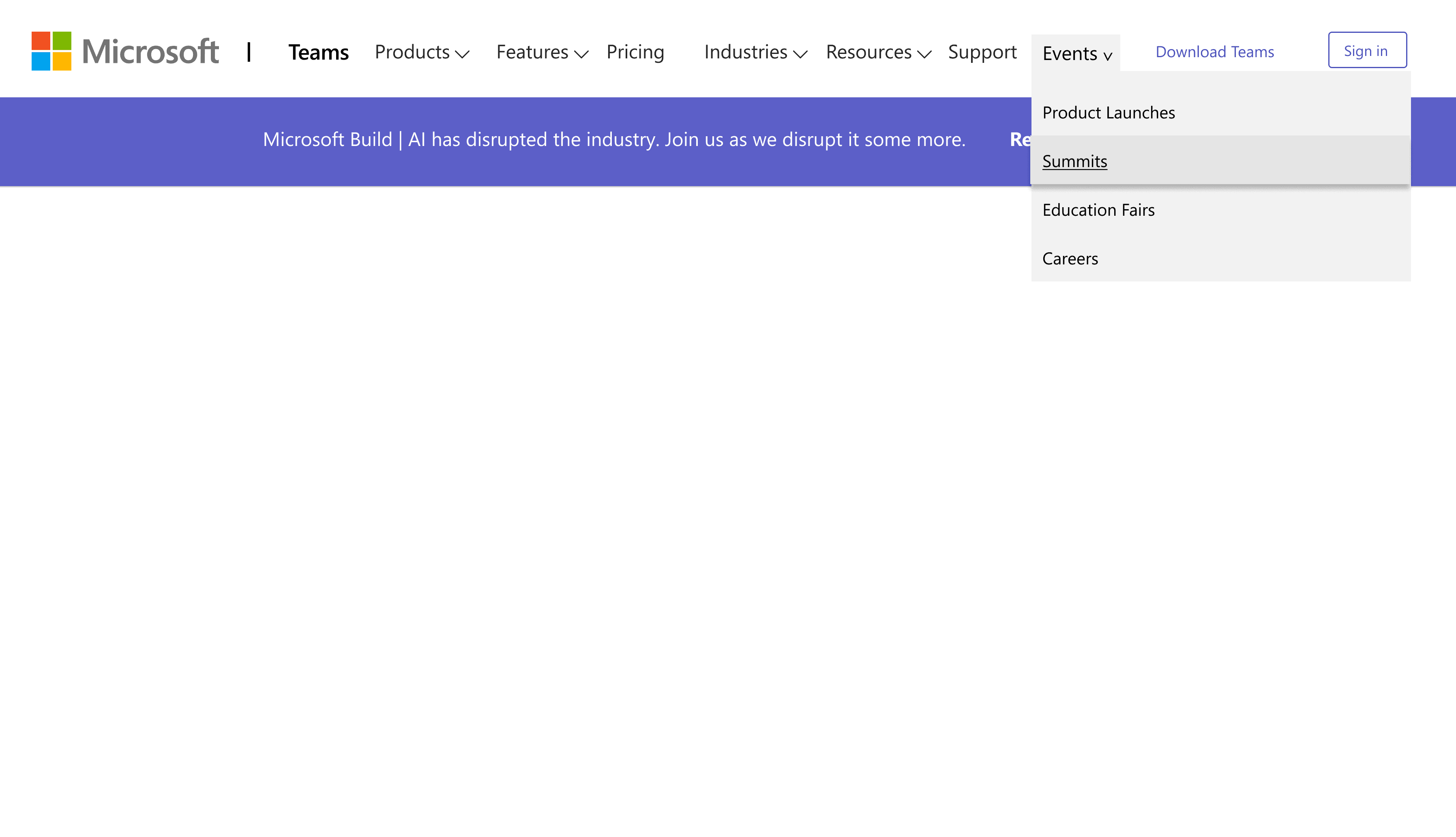
Clumped action buttons and text in dropdowns create visual imbalance.

Information Hierarchy

Information Hierarchy

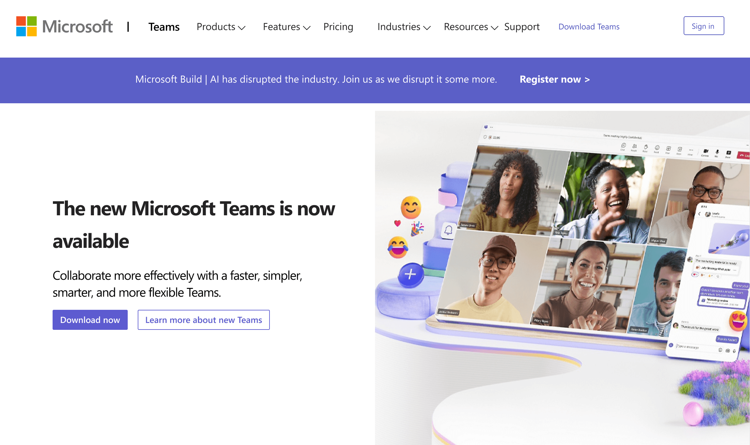
The placement of news before features may confuse users about the app's core functionalities.

Reimagining the design

Based on my findings, I created a mockup that addressed the identified issues while maintaining the strengths of the original design.

Key changes include:

Rearranging sections to prioritize features over news

Replacing breadcrumbs with cards for more direct information display

Introducing an "Event Accordion" component to consolidate event types

Features and outcomes

Feature

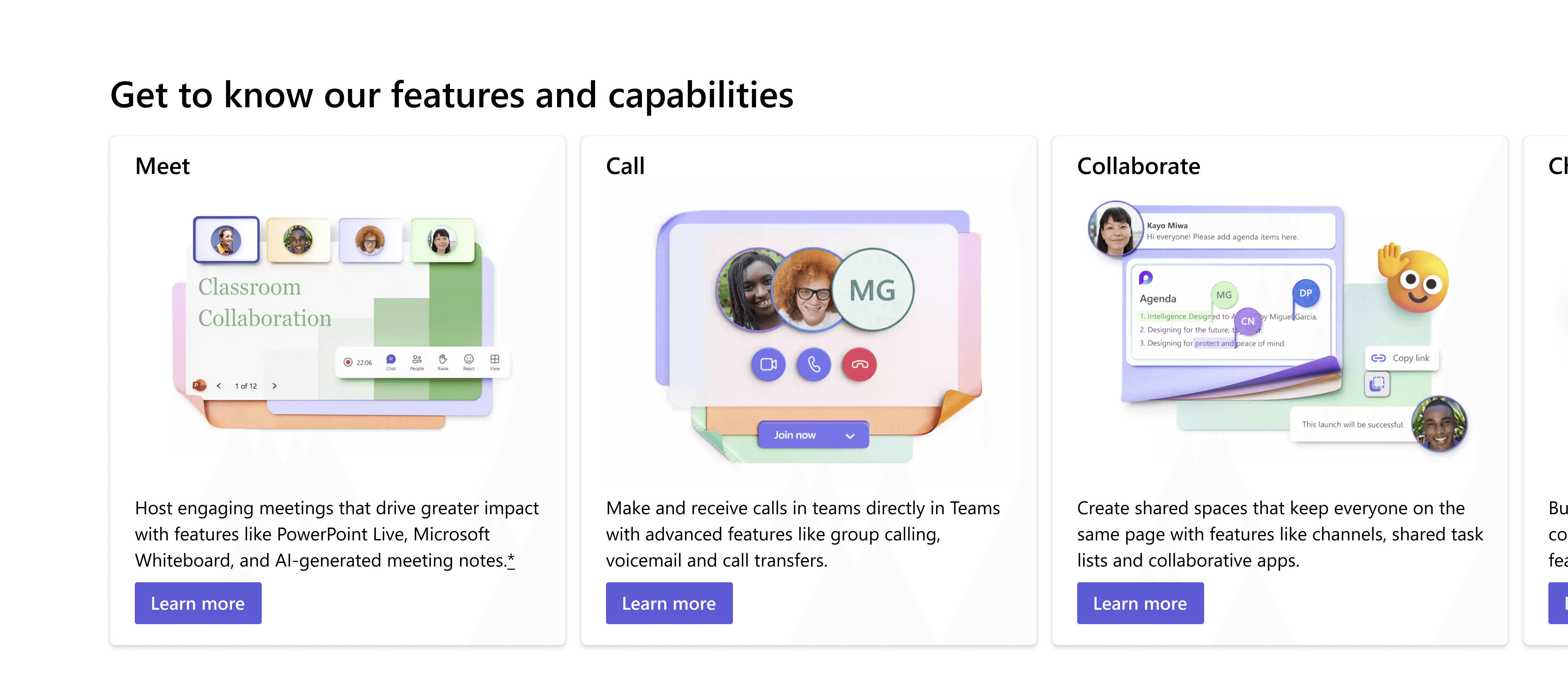
Reconstructed the hierarchy, by arranging the features of teams in 2x2 grid format.

Outcome

Users can quickly access functionalities, reducing time to value.

Enhanced Visual Communication

Feature

Replaced breadcrumbs with informative cards and horizontal scroll.

Outcome

More direct and engaging information display, improving content comprehension

Streamlined event management

Feature

Introducing "Event" accordion component

Outcome

Consolidated view of event types, simplifying user interaction and reducing cognitive load

Reflections

Reflections

Reflections

Things I Learned

Things I Learned

Learned balancing the Aesthetics and Functionality

As a UX designer, by working on the Teams redesign project I understood the critical importance of balancing visual appeal with practical functionality. It's essential to create designs that are not only aesthetically pleasing but also highly usable and efficient. This balance is key to improving user adoption and satisfaction in professional tools like Microsoft Teams.

Leveraging Design Systems for Consistency and Innovation

Working within the constraints of Microsoft's Fluent 2 design system revealed both the challenges and opportunities of established design frameworks. While ensuring consistency across the platform, it also provided a solid foundation for innovative solutions like the "Event Accordion".

User-Centric Approach to Information Architecture

The process of reorganizing content and improving information hierarchy emphasized the crucial role of a user-centric approach in UX design. By prioritizing features over news and introducing clearer navigation, we aimed to reduce cognitive load and improve user experience.

Hurray! you've made it to the end!

Hurray! you've made it to the end!

Create a free website with Framer, the website builder loved by startups, designers and agencies.